 March 27, 2018
  Synergetic
  Corporate Events
 You’ve been tasked with creating the PowerPoint slideshow for your group’s sales presentation to help deliver your message to your audience. After hours and hours and countless Google searches on how to add a text box, you make a great looking presentation, complete with fun animations and transitions, just to find out the day of the presentation that the screen and presentation aren’t the same size… or shape. If you haven’t been in this situation yourself, chances are, you’ve seen it happen at another meeting or presentation. For the audio/visual professional or discerning audience member, this is a cringeworthy happening that is all too common in the industry, and one that can be easily avoided. So, how do you avoid it? And what ‘it’ are we even talking about?
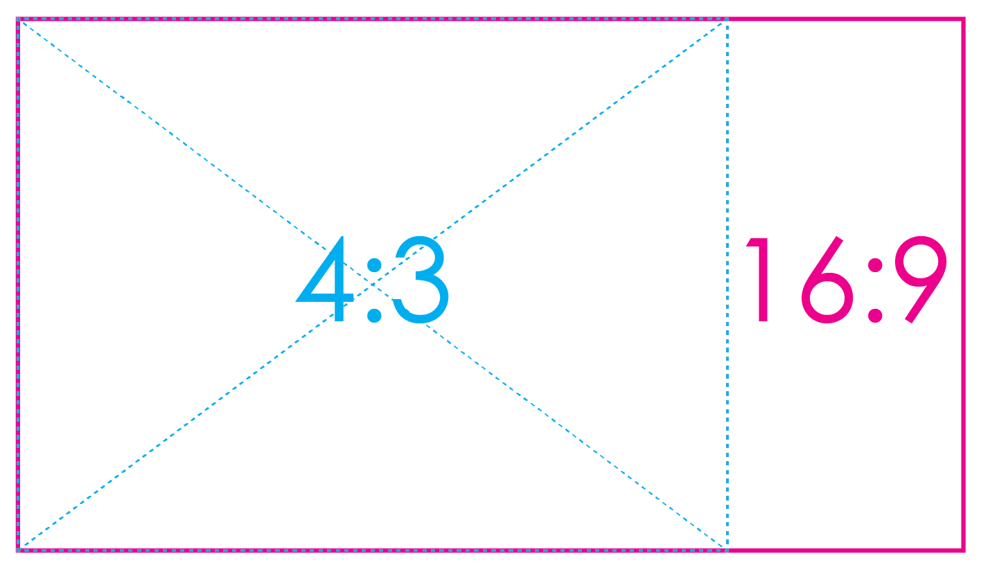
Aspect ratios.
The term ‘aspect ratio’ refers to the shape of a screen (or slideshow presentation) with regards to the width and height, in relation to one another. Aspect ratios should not be confused with resolutions, though, which simply refer to the pixel count of an image to provide the user with an idea as to picture quality. Today, we’ll be looking at two common ratios: 16:9 and 4:3, with the latter being phased out in favor of wider formats more suitable for modern high-definition pictures. In a 16:9 ratio, the screen or image is noticeably wider than it is tall, and in a 4:3 format, the image is nearly square, as illustrated below:
So, what does all of this really mean? And why does it matter?
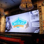
Well, if you want your presentation to look as good as it possibly can while simultaneously filling the screen that your slideshow is being displayed on, you’ll want to know which ratio to design in. If you create a PowerPoint in a 4:3 ratio and display it on a 16:9 screen, you’ll notice large black vertical bars that fill the empty space on both sides of the screen, making for a less-than-attractive final product. We see this commonly in situations where an old PowerPoint is being reused for future presentations. If you are recycling an old slideshow for this year’s event, consider inspecting the document’s settings and redesigning it to be optimized for 16:9 screens; thus, eliminating the black bars and filling the screen entirely with your image. Here are a few examples of 4:3 ratio slideshows that were displayed on 16:9 ratio screens:

-

- Artistic Imagery
-

- Wise Image Photography
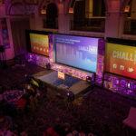
As you can see above, the images above do not fill the entire screen, leaving valuable real estate unused. Designing a presentation that is optimized for the aspect ratio of the screens allows for text and embedded images to be larger, and also allows the guests in seats positioned further away from the screens to be able to read and comprehend your message easier. Finally, your presentation will look more professional and attractive. Here are examples of slideshows that were designed in the same aspect ratio as the screens:
-
- Philip Gabriel Photography
-

- Wise Image Photography
-
- Wise Image Photography
 July 11, 2026
  Synergetic
  Helpful Information